Reports customization
The Reports feature helps you monitor team performance, workload, and ticket activity through visual dashboards and charts.
Every HelpDesk instance includes a set of built-in reports that provide insights into tickets, requesters, and agents. If you need more specific metrics or visualizations, you can customize existing reports using Dashboard Designer.
Install Dashboard Designer
Dashboard Designer (SharePoint Charts) extends the default reporting capabilities of HelpDesk. Use this additional solution to customize your existing charts based on your team’s reporting needs.
Note
Dashboard Designer is a separate product by Plumsail with its own pricing. For additional installation options and information, see our documentation.
Installing an app through the SharePoint Admin Center requires SharePoint Administrator or Global Administrator permissions in Microsoft 365.
To install Dashboard Designer for SharePoint Online, first complete our form and select the appropriate SharePoint version.
Download the Dashboard Designer package for Microsoft 365 using the link provided after submitting the form.
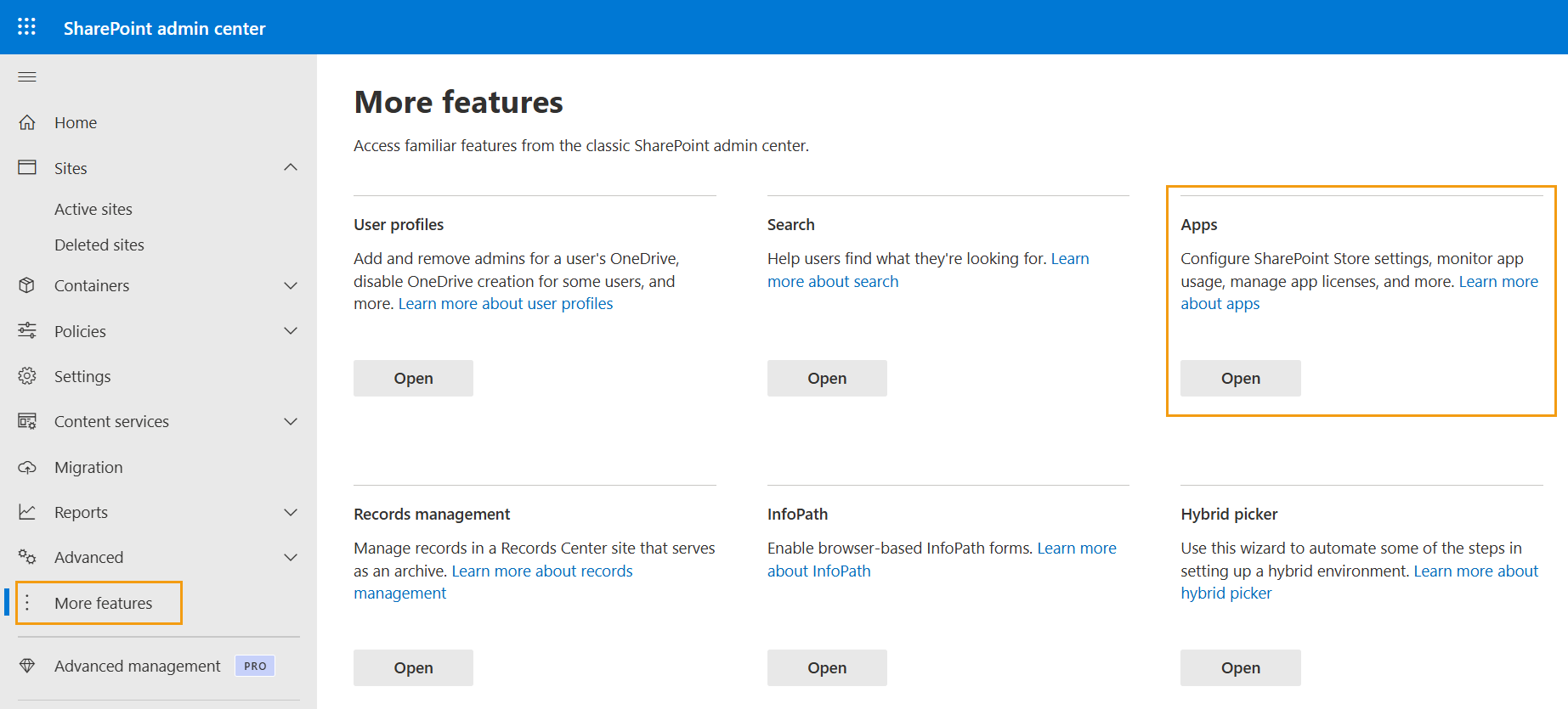
Open the SharePoint Admin Center.
Navigate to More features → Apps.
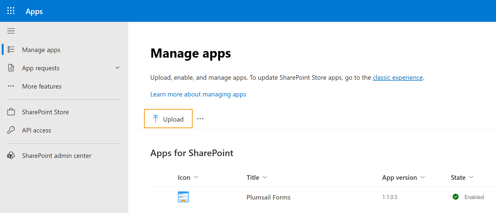
Upload the package downloaded. Make sure to upload the
.sppkgfile without extracting its contents.
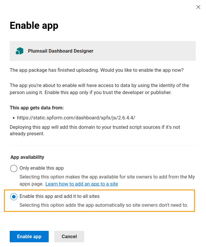
In the confirmation dialog, select Enable this app and add it to all sites, then click Enable app.
Once Dashboard Designer is installed, you can customize reports based on your HelpDesk data.
Customize reports
To customize a report, open the Reports page and switch it to edit mode.
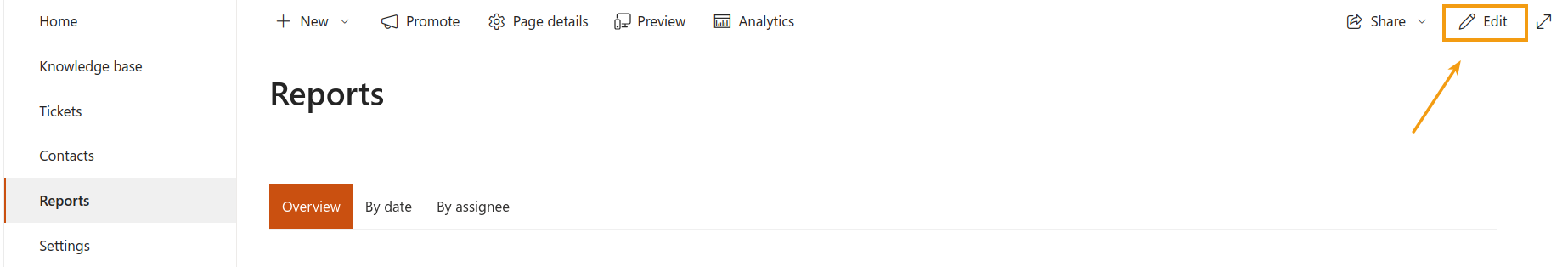
Select the chart you want to modify, click Edit properties, and then choose Configure in the right-hand panel.
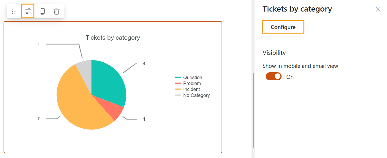
The editor allows you to customize both the data displayed in the report and the chart’s looks.
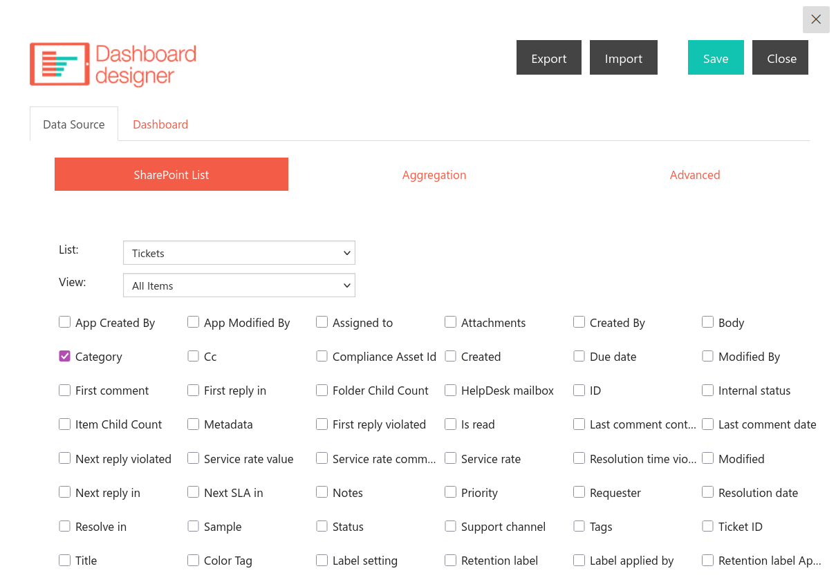
Data Source: Select a SharePoint list, choose which fields to use, configure aggregation settings, or use the advanced editor for more complex scenarios.
Dashboard: Customize the chart layout, appearance, labels, and other visual settings.
Use the Preview button on the Dashboard tab to see how the chart looks before applying your changes. When you are done, click Save to apply the new configuration, then stop edit mode on the Reports page.
Tip
To discard your changes, click Close instead of Save. The chart keeps its previous configuration.
Note
Looking for more information about reports? See the Reports documentation to learn about default charts and metrics.